
Start by testing a short paragraph in one of these fonts: Lexend, OpenDyslexic, Arial, Verdana, Helvetica, or Calibri. These are the best starting points for dyslexia friendly text because they share clean letterforms, generous spacing, and wide availability across every major platform. No single font works for every reader, but these six cover the range of what accessibility research and professional guidance consistently recommend.
Here is a one-minute test you can run right now: copy a short paragraph your child or student reads regularly, paste it twice into a Word document or Google Doc, set one copy in their current font and the other in Lexend or Arial, then ask them to read both aloud. Note which one feels easier and takes less time. That single comparison tells you more than any font ranking ever will.
Quick shortlist to try first:
- Lexend — free, Google Fonts, designed specifically for reading fluency
- OpenDyslexic — free, open-source, heavy-bottom letterforms
- Arial — free, pre-installed everywhere, clean and familiar
- Verdana — free, pre-installed, wide letters with open spacing
- Helvetica — free on macOS, clean sans-serif, widely trusted
- Calibri — free, pre-installed in Microsoft Office, modern and readable
Key Takeaways
Sans-serif fonts with generous spacing are the most reliable starting point for dyslexic readers, but individual testing across multiple sessions is the only way to confirm what actually helps a specific person.
| Point | Details |
|---|---|
| Test individually | No font works for every reader; run a 3-session A/B test before committing to any change. |
| Spacing matters most | Letter, word, and line spacing reduce visual crowding more reliably than any branded font. |
| Start with free sans-serifs | Arial, Verdana, Lexend, and Calibri are pre-installed or freely available and cover most needs. |
| Combine changes | Pair font choice with 14pt+ size, 1.5x line spacing, and a cream background for best results. |
| Thepocketmoneygame | Built with accessibility-friendly formatting, voice support, and adjustable difficulty for neurodiverse readers aged 5– |
Table of Contents
- What are the best dyslexia friendly fonts to try?
- What does the research actually say about fonts for dyslexia?
- How do you choose and test a font for one reader?
- How do you install and apply these fonts on your devices?
- Where can you download these fonts and find accessibility tools?
- A reproducible testing protocol for parents and teachers
- Why I think we're asking the wrong question about dyslexia fonts
- Thepocketmoneygame supports neurodiverse readers from day one
- Useful sources and further reading
What are the best dyslexia friendly fonts to try?
There is no universal winner. The fonts below are recommended because they follow accessible typography best practices: simple letterforms, open counters, and enough spacing to reduce visual crowding. Each entry notes where it works best, what it costs, and what the evidence actually says.
OpenDyslexic
Designed specifically for readers with dyslexia, OpenDyslexic uses heavier bottoms on each letter to reduce rotation confusion (mistaking "b" for "d," for example). It is free and open-source under the SIL Open Font License, meaning you can use it for personal, educational, or commercial projects at no cost. Works well for on-screen body text and is installable on Windows, macOS, iOS, Android, and as a browser extension. The caveat: peer-reviewed studies have not confirmed consistent reading speed improvements, so treat it as a strong candidate to test rather than a guaranteed fix.
Lexend
Lexend was developed with the specific goal of reducing visual stress and improving reading fluency. It is free via Google Fonts, which means you can embed it in any website with a single line of CSS or install it on any desktop. The font family includes several width variants (Lexend Deca, Lexend Giga, and others), giving you flexibility for headings versus body text. Best use case: on-screen reading for children and adults. The research base is still growing, but its design principles align closely with what spacing studies support.
Arial
Arial is the most practical starting point for most families and teachers. It is pre-installed on every Windows and macOS device, costs nothing, and its clean sans-serif design avoids the decorative strokes that can trip up dyslexic readers. Studies comparing font types consistently place sans-serif styles among the better performers for on-screen readability. Best for body text in Word, Google Docs, emails, and websites.
Verdana
Verdana was designed by Matthew Carter specifically for screen readability, with wider letter spacing and taller lowercase letters than Arial. Those wider proportions make it particularly good for younger readers or anyone who struggles with letters that look similar ("a" vs "o," "c" vs "e"). Pre-installed on Windows and macOS, free, and works well for both on-screen body text and print. The slightly wider footprint means it takes up more space per line, which is actually a benefit for readability.
Helvetica
Helvetica is a clean, neutral sans-serif that comes pre-installed on macOS and iOS. It is not freely available for Windows without a license purchase, which limits its reach. For Mac users, it is a solid option for on-screen reading and print. Its letterforms are simple and familiar, which reduces the cognitive effort of decoding. No dyslexia-specific research backs it directly, but its design characteristics match what general readability research recommends.
Calibri
Calibri is the default font in Microsoft Office and is pre-installed on every Windows device. Microsoft has also released font variants with extra letter, word, and line spacing specifically to reduce visual crowding, a factor that affects many dyslexic readers. That makes Calibri with the spacing variant a practical, zero-cost option for anyone already working in Word or Outlook. Best for documents, emails, and print.
Dyslexie
Dyslexie is a commercial font designed by Christian Boer, a graphic designer with dyslexia. It uses distinct letterforms, heavier bottoms, and unique glyph shapes to reduce letter confusion. A personal license costs money, though a free version exists for home use. Studies comparing Dyslexie to mainstream fonts have produced mixed results, with some finding no improvement in reading speed or accuracy. Worth testing if your reader responds well to its distinctive style, but the evidence does not support paying for it over free alternatives without first running your own test.
Comic Sans
Comic Sans gets mocked endlessly, but it genuinely has characteristics that help some dyslexic readers: irregular letterforms that make each character more distinct, open counters, and a casual style that reduces the visual uniformity that causes letters to blur together. It is free and pre-installed everywhere. The main limitation is social: many older students and adults find it embarrassing to use in school or work contexts. For young children at home, it is a perfectly reasonable option to test.
Sylexiad
Sylexiad is a research-based font family developed by Robert Hillier specifically for adult dyslexic readers. It comes in serif and sans-serif versions and was designed with input from dyslexic adults. It is less widely known than the others on this list and is not pre-installed on any standard device, so you will need to download and install it manually. Best suited for print and formal documents rather than on-screen body text. Licensing details are available directly from the designer.
Letterform features that matter when comparing these fonts:
- Heavier bottoms — used by OpenDyslexic and Dyslexie to anchor letters and reduce rotation errors
What does the research actually say about fonts for dyslexia?
The honest answer is that the evidence is mixed, and spacing often matters more than the font name on the label. Some features, including generous spacing, larger type sizes, and simple letterforms, show consistent support across studies. Branded "dyslexia fonts" are a different story.
An eye-tracking study of 48 dyslexic readers found that sans-serif, monospaced, and roman styles significantly improved reading performance compared to serif, proportional, and italic fonts. That is useful: it tells you the category of font matters. It does not tell you that OpenDyslexic beats Arial.
Study highlight: In a within-subject design where participants with dyslexia read texts in different fonts, sans-serif and monospaced fonts produced better reading performance than serif and italic alternatives.
Comparative studies reviewed by Edutopia found that OpenDyslexic and Dyslexie did not consistently improve reading speed or accuracy over Arial or Times New Roman. Some participants actually performed worse with the specialized fonts. The International Dyslexia Association reaches the same conclusion: no conclusive evidence supports universal benefit from special fonts, and broader formatting choices and instructional approaches matter more.
The IFLA guidelines for library services to people with dyslexia reinforce this: offer multiple formats, use plain familiar fonts, and prioritize spacing over any single font brand.
Common limitations in the research:
- Small sample sizes make it hard to generalize findings
- Studies mix children and adults, whose needs differ
- Self-reported preference does not always match actual reading performance
- Dyslexia profiles vary widely; a font that helps one reader may slow another
- Many studies test reading speed but not comprehension, fatigue, or sustained effort
Pro Tip: Run your own A/B test before committing to any font. Individual response varies so much that a single well-run personal test is more reliable than any published ranking.
How do you choose and test a font for one reader?
Use a short, reproducible A/B test rather than assuming any font is universally better. The goal is to measure whether a specific font helps a specific person, not to confirm a general theory.
Before you start, set these conditions:
- Use the same passage for both fonts (same length, same difficulty)
- Same device, same screen brightness, same time of day
- Same font size (14pt is a good starting point) and line spacing (1.5x minimum)
- Turn read-aloud support off for the timed portion, then on for the comfort check
Step-by-step testing protocol:
- Choose two fonts to compare (e.g., Arial vs. Lexend, or current font vs. OpenDyslexic).
- Print or display the same 100-word passage in each font, labeled only "A" and "B."
- Ask the reader to read passage A aloud. Record the time and note any errors or hesitations.
- After a short break (at least 5 minutes), repeat with passage B.
- Ask the reader: "Which one felt easier? Which one would you choose for a longer book?"
- Record reading time, error count, self-reported effort (1 = very hard, 5 = very easy), and preference.
- Repeat the test with two more different passages across separate sessions before drawing conclusions.
What to record for each trial:
- Reading time in seconds
- Number of miscues or skipped words
- Self-reported effort score (1–5)
- Fatigue after reading (did they want to stop early?)
- Stated preference
A consistent difference of 10% or more in reading time, or a clear and repeated preference for one font, is worth acting on. A one-session result that reverses the next day is noise. If you see persistent difficulty regardless of font, that is a signal to consult a reading specialist or educational psychologist. You can also look at signs of dyslexia in primary school children for guidance on when to seek a professional assessment.
How do you install and apply these fonts on your devices?
You can have any of the free fonts above running in under five minutes. Here are the steps for the most common platforms.
Windows:
- Download the font file (.ttf or .otf) from a trusted source (Google Fonts, OpenDyslexic.org)
- Right-click the file and select "Install" or "Install for all users"
- The font will appear in Word, Google Chrome, and all other apps immediately
macOS:
- Download the font file
- Double-click to open Font Book, then click "Install Font"
- Available system-wide instantly
Google Docs:
- Open the font selector, click "More fonts," and search for Lexend or any Google Font
- For non-Google fonts like OpenDyslexic, install the font on your device first; it will then appear in Docs
Microsoft Word:
- Install the font on your device (steps above), then select it from the font dropdown in Word
- For the Microsoft spacing variants of Calibri, download them directly from Microsoft's font variants page
For websites (CSS):
body {
  font-family: 'Lexend', Arial, sans-serif;
  font-size: 18px;
  line-height: 1.6;
  letter-spacing: 0.05em;
  word-spacing: 0.1em;
}
This stack tries Lexend first, falls back to Arial, then any sans-serif. The spacing values reflect what Smithsonian accessibility guidelines and professional formatting guidance recommend for on-screen readability.
Pro Tip: Changing the font alone gives you maybe half the benefit. Pair it with 1.5x line spacing, a minimum 14pt size, and a cream or light yellow background instead of pure white. That combination reduces visual stress more than any single font swap.
Where can you download these fonts and find accessibility tools?
Use reputable sources and check licensing before downloading, especially for commercial or school use.
| Resource | Cost / License | Best Use Case | Where to Get It |
|---|---|---|---|
| OpenDyslexic | Free, SIL-OFL | On-screen body text, browser use | opendyslexic.org |
| Lexend | Free, SIL-OFL | On-screen reading, web embedding | fonts.google.com |
| Dyslexie | Free (personal), paid (commercial) | On-screen and print, personal use | dyslexiefont.com |
| Sylexiad | Contact designer | Print, formal documents | roberthillier.com |
| Microsoft Calibri spacing variants | Free (Windows users) | Word, Outlook, Office documents | microsoft.com/download |
| Google Fonts library | Free, SIL-OFL | Web embedding, Google Docs | fonts.google.com |
Browser extensions and accessibility tools:
- OpenDyslexic for Chrome — replaces fonts on any webpage with OpenDyslexic; free in the Chrome Web Store
- Microsoft Immersive Reader — built into Edge, Word, and OneNote; allows font and spacing changes plus read-aloud on any document
A note on licensing: SIL-OFL fonts (OpenDyslexic, Lexend) are free for personal, educational, and commercial use. Dyslexie's free version covers personal home use only; schools and businesses need a paid license. Always verify before distributing materials with a commercial font embedded.
A reproducible testing protocol for parents and teachers
Use this short protocol to collect real data across multiple sessions before deciding whether a font change is helping your learner.
Setup: Prepare three short passages of equal difficulty (roughly 100 words each, appropriate for the reader's level). Label them Passage 1, 2, and 3. Print or display each in Font A and Font B at 14pt, 1.5x line spacing, on a white or cream background.
Step-by-step:
- Session 1: Read Passage 1 in Font A, rest 5 minutes, read Passage 1 in Font B. Record scores.
- Session 2 (next day): Read Passage 2 in Font B first, then Font A. Reverse the order to control for warm-up effects.
- Session 3: Read Passage 3 in Font A, rest, Font B. Ask the reader to choose their preferred version.
Score sheet fields to record for each trial:
| Field | What to Record |
|---|---|
| Passage ID | 1, 2, or 3 |
| Font | A (name) or B (name) |
| Reading time | Seconds to complete passage |
| Errors | Miscues, skips, or substitutions |
| Effort score | 1 (very hard) to 5 (very easy) |
| Fatigue | Did the reader want to stop early? Yes / No |
| Preference | Which font did the reader choose? |
| Notes | Anything unusual (distraction, illness, etc.) |
Interpreting results: If the same font produces faster reading, fewer errors, and a higher effort score across all three sessions, that is a meaningful signal. If results flip between sessions, the difference is probably noise. Consistent preference without a performance difference is still worth acting on, since comfort and willingness to read matter enormously for long-term literacy. If neither font produces a clear benefit, shift focus to spacing, size, and background contrast before trying more fonts.
Why I think we're asking the wrong question about dyslexia fonts
Most of the conversation around accessible typography focuses on which font is "the best," as if there is a single answer waiting to be discovered. The research keeps pushing back on that framing, and I think it is worth being direct about why.
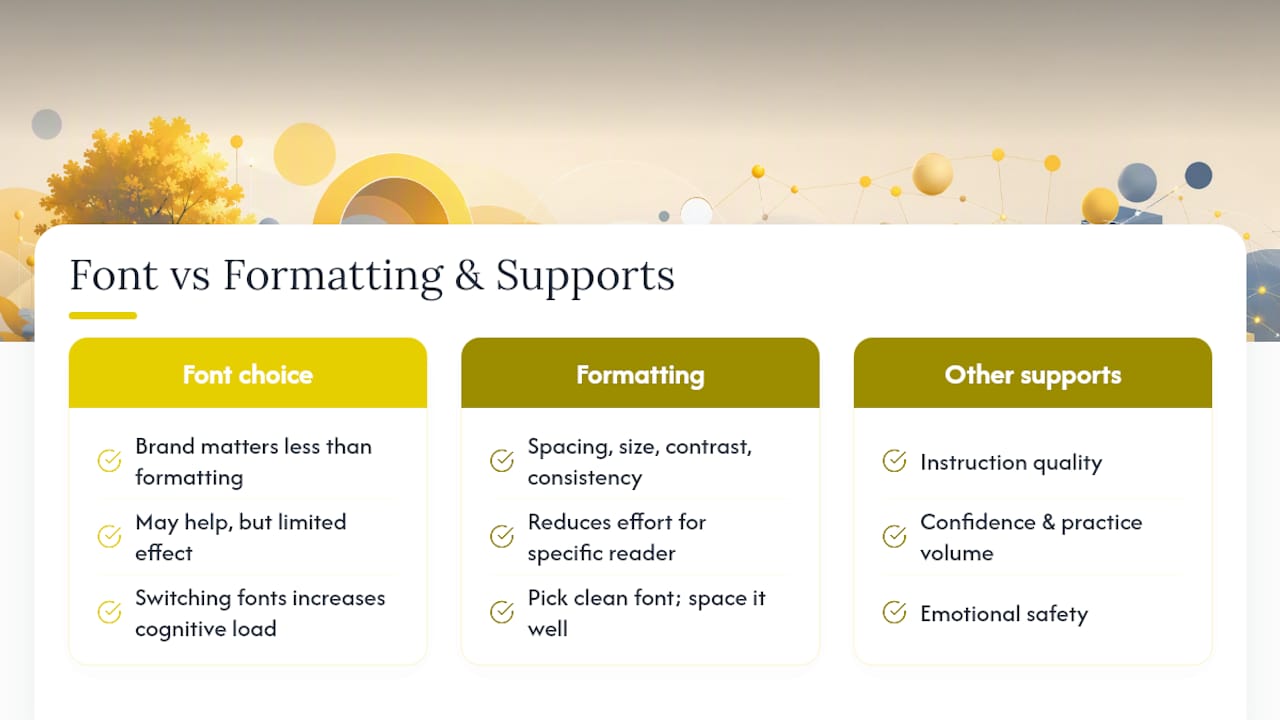
The eye-tracking study, the IDA review, the Edutopia synthesis — they all point to the same uncomfortable truth: the font brand matters less than the formatting around it. Spacing, size, contrast, and consistency do more work than any specially designed letterform. That does not mean OpenDyslexic or Lexend are useless. It means the question "which font should I use?" is less useful than "what combination of formatting choices reduces effort for this specific reader?"
There is also something practitioners notice that rarely makes it into published studies: consistency itself is calming. A reader who encounters the same clean, well-spaced font across all their materials, every session, every day, builds a kind of visual familiarity that reduces the cognitive overhead of decoding. Switching fonts frequently in search of a better option can actually increase load, not reduce it. Pick something clean, space it well, and stick with it long enough to give the reader a fair chance to adapt.
The other thing worth saying plainly: font choice is one small piece of a much larger picture. If a child is struggling to read, the font is rarely the primary barrier. Instruction, confidence, practice volume, and emotional safety matter far more. Font accessibility is a floor, not a ceiling.
Thepocketmoneygame supports neurodiverse readers from day one
If you want a learning environment that already has the formatting work done for you, Thepocketmoneygame is built with exactly that in mind. The platform was developed by a parent with ADHD and dyslexia, so accessibility-friendly design is not an afterthought.
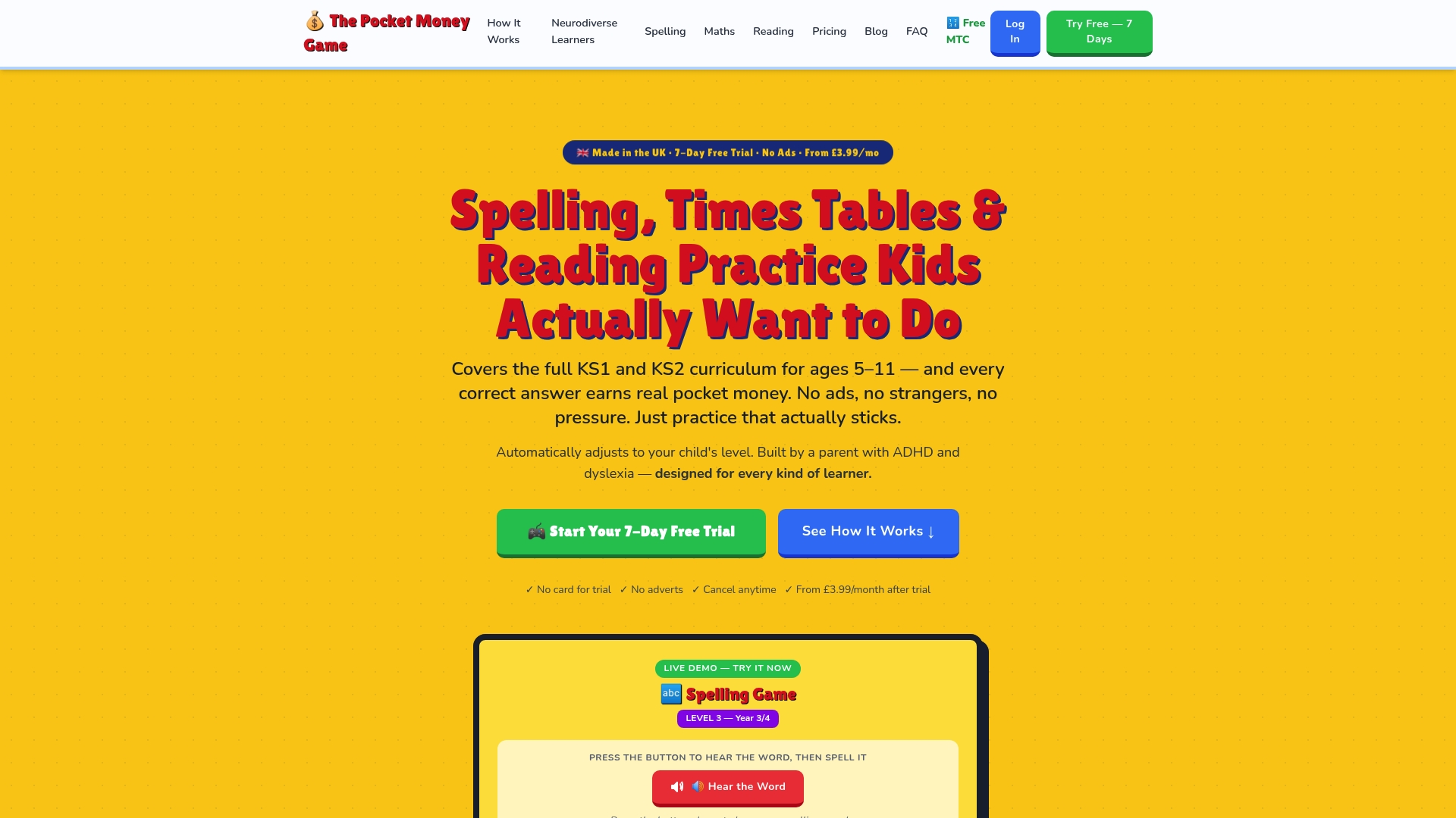
- How to try it: start with a free trial at The Pocket Money Game — no download needed, and parents stay in control of difficulty and rewards throughout.
Individual font testing is still recommended alongside any platform, since every reader responds differently. But if you want a structured, accessible starting point that does not require you to configure everything yourself, this is a practical next step.
This article provides general information about font accessibility and is not a substitute for assessment by a qualified reading specialist or educational psychologist.
Useful sources and further reading
These are the primary sources used in the evidence section above, plus the key downloads mentioned throughout.
- Do Dyslexia Fonts Actually Work? | Edutopia
- OpenDyslexic: About
- Do Special Fonts Help People with Dyslexia? | IDA
- Microsoft font variants to help readers with visual crowding
- Smithsonian Guidelines for Accessible Design
- Guidelines for library services to persons with dyslexia (IFLA)
Recommended
- Why Standard Learning Apps Don't Work for Kids with Dyslexia | The Pocket Money Game
- Spelling Practice for Children with Dyslexia: What Actually Helps | The Pocket Money Game
- How to Help a Dyslexic Child Practice Statutory Spelling Words | The Pocket Money Game
- Signs of Dyslexia in Primary School Children | The Pocket Money Game